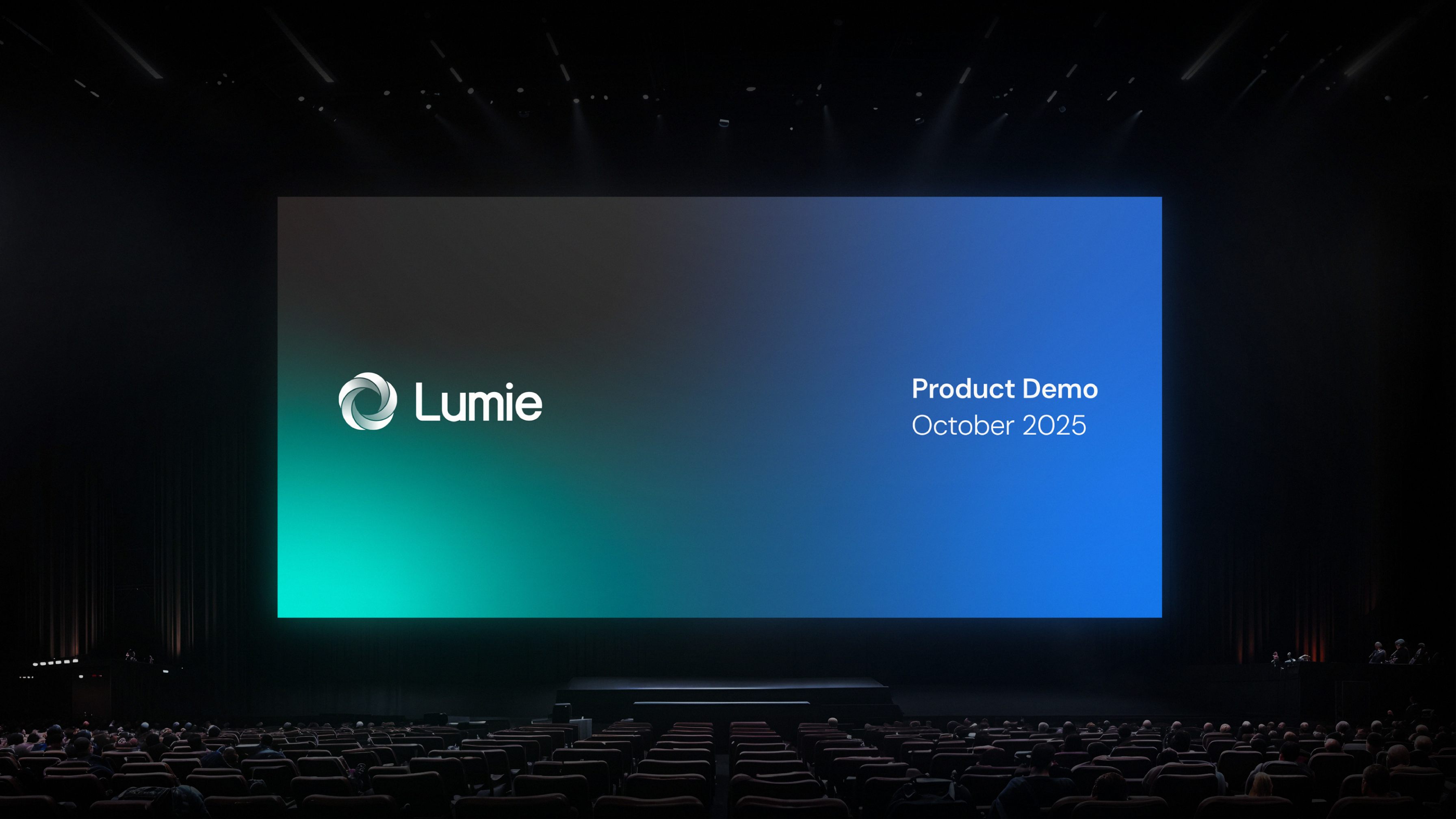
Lumie
AI Healthcare · Product Storytelling, Brand Strategy, Visual System, Motion Direction, Digital Launch Assets
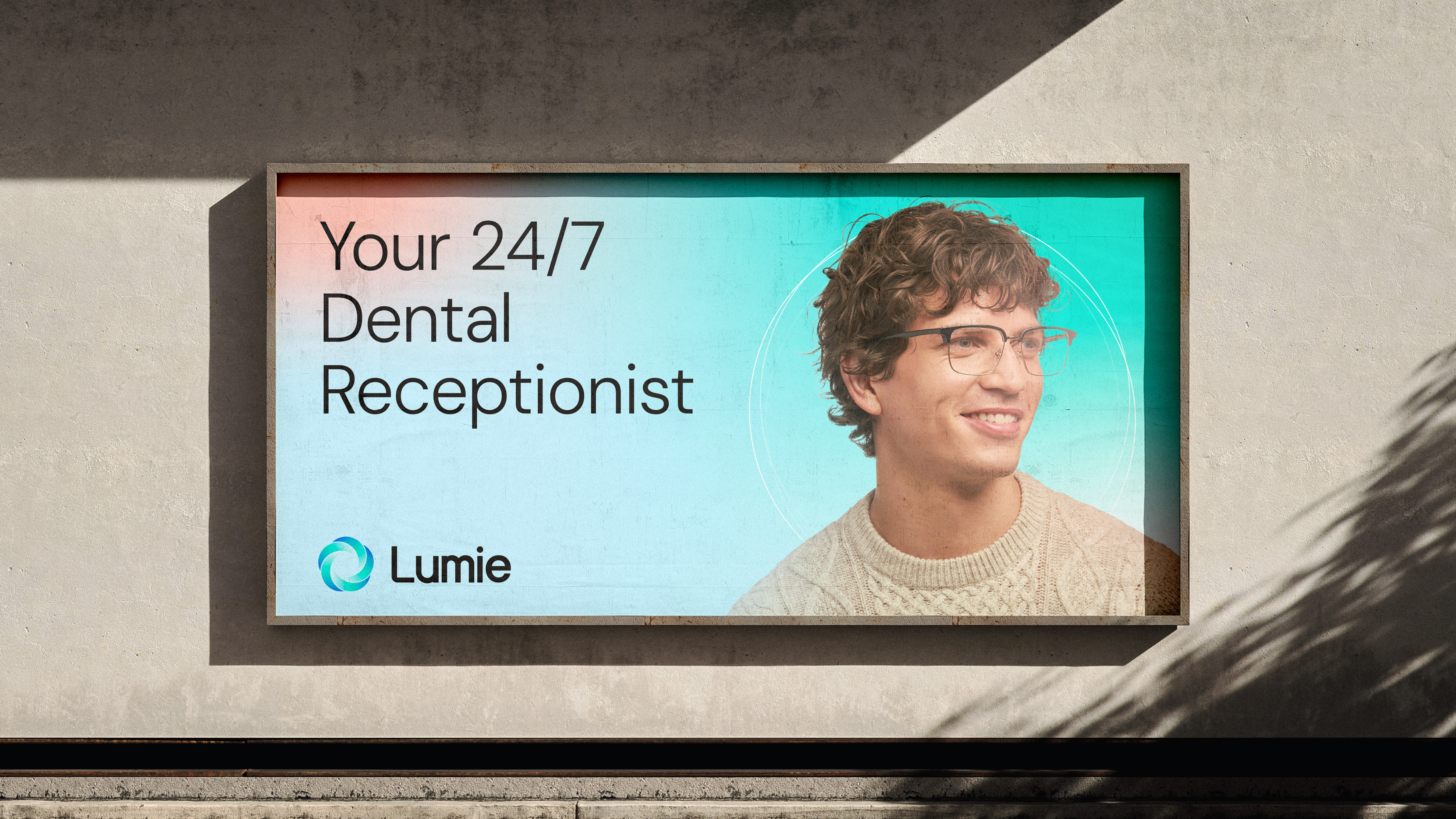
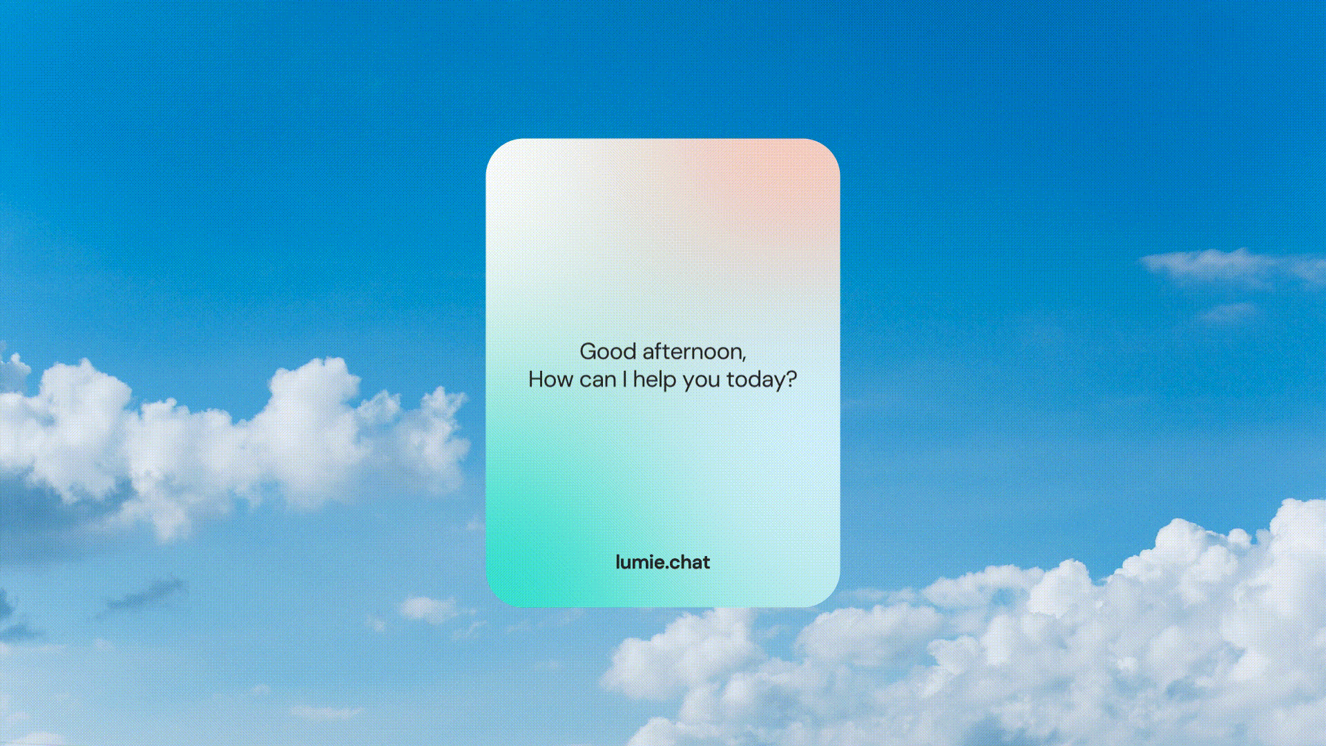
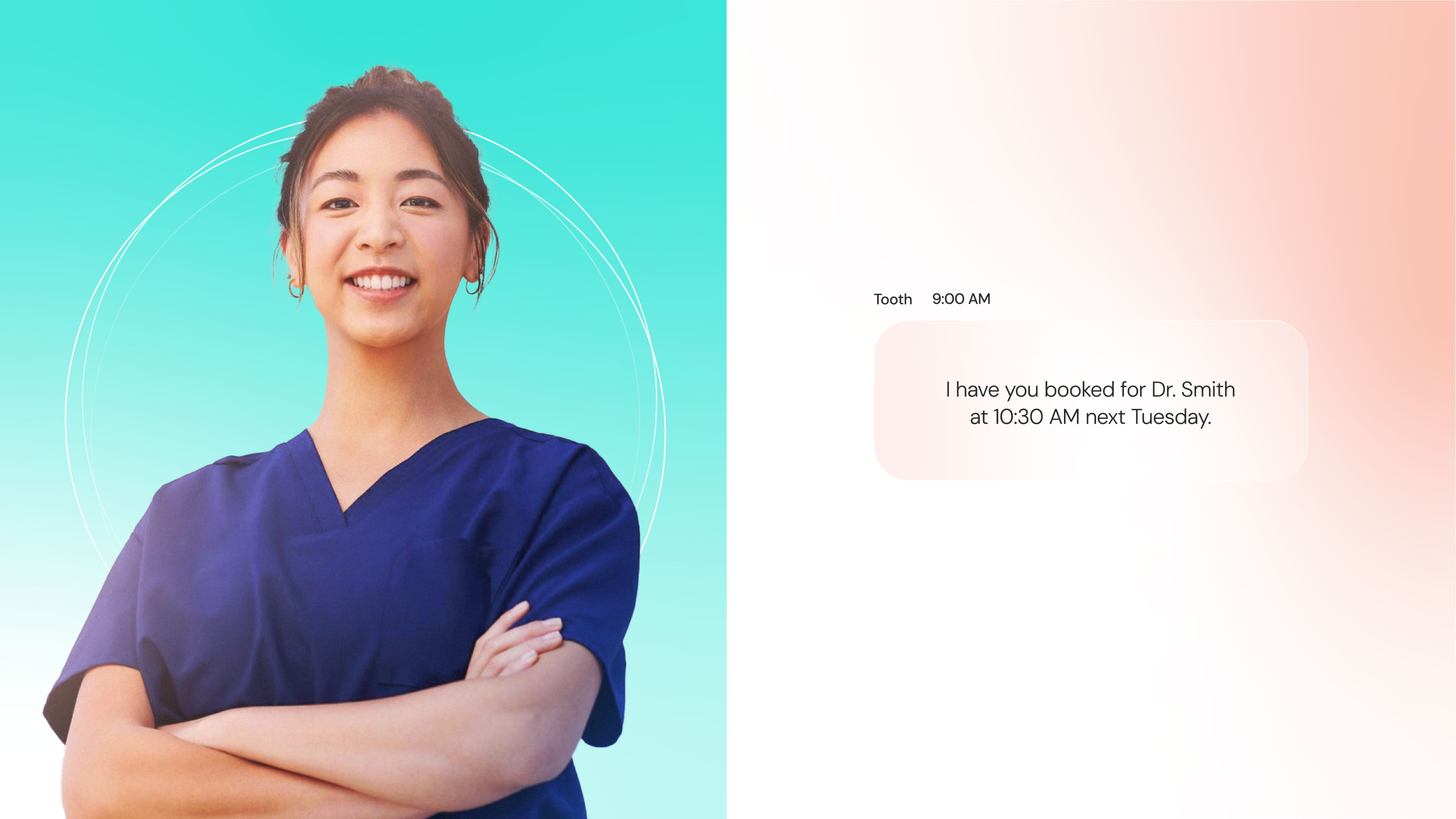
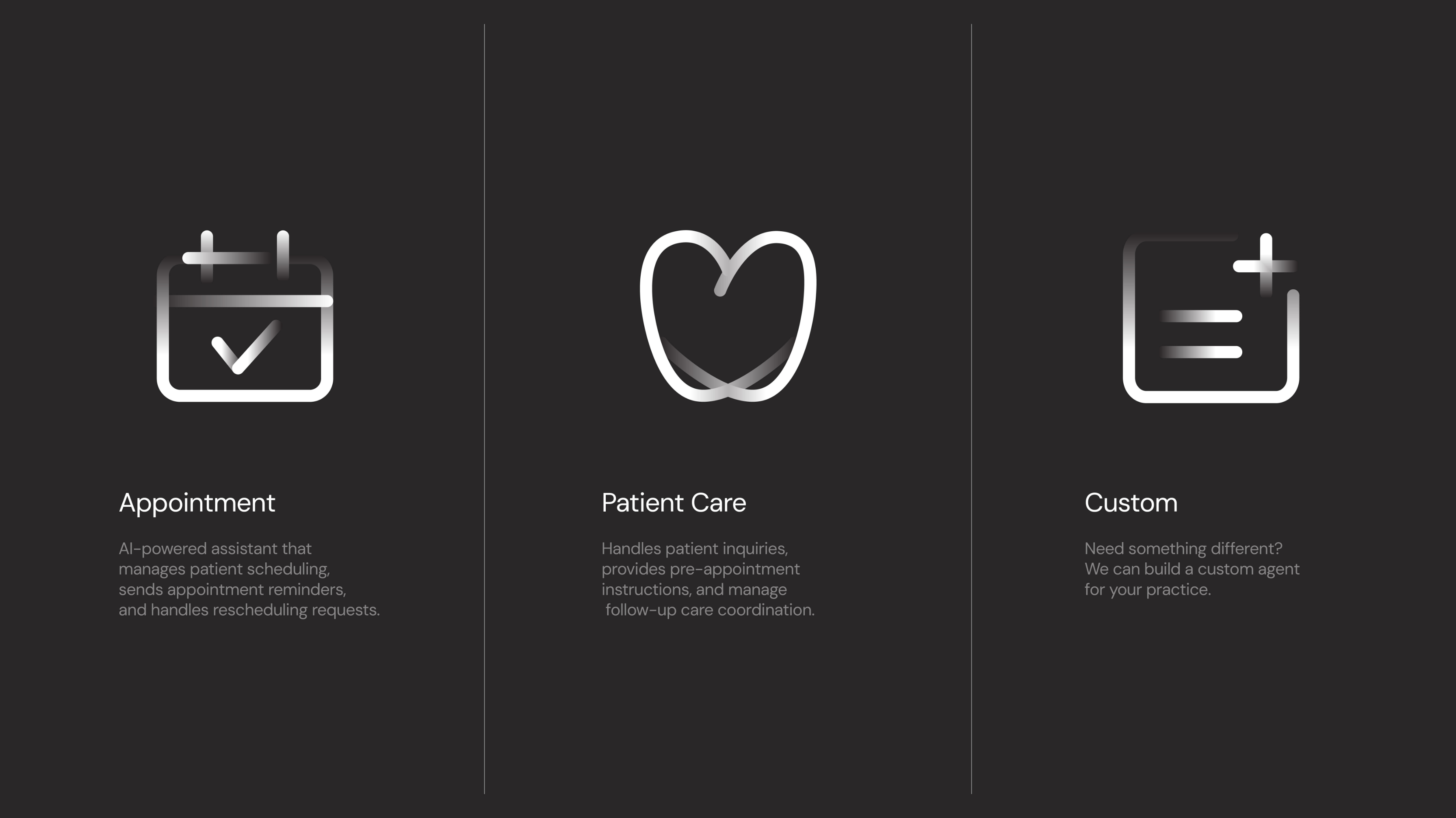
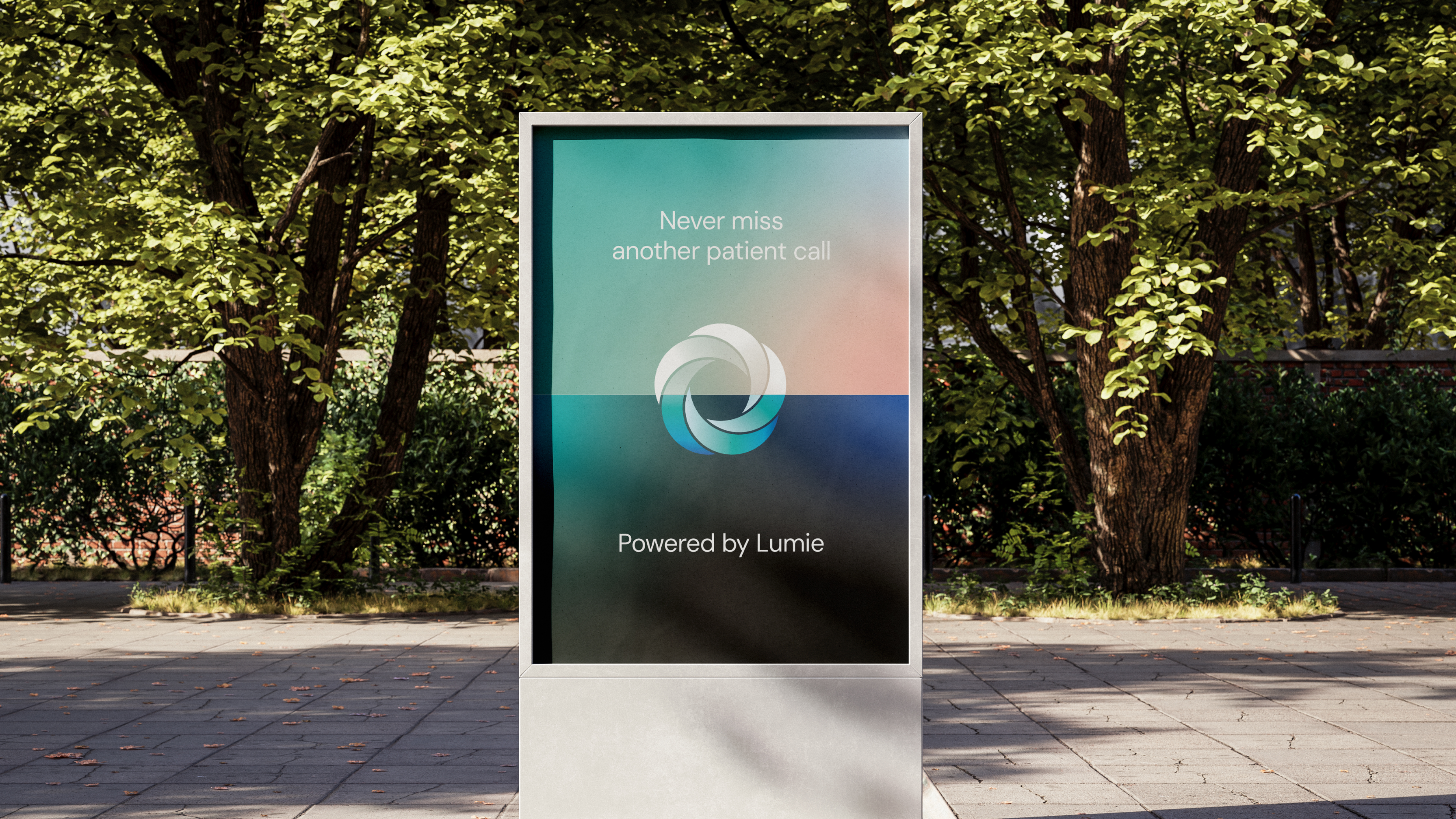
Lumie is a virtual receptionist designed for dental clinics, helping answer patient calls, manage bookings, and handle front-desk communication with a calm, human tone. The project responds to a common clinic challenge, such as patients often call feeling unsure and anxious, while front-desk teams are already stretched. Lumie is built around the way dental practices actually operate, rather than using generic automation. This allows each interaction to feel clear and considerate, helping clinics capture more calls while giving patients a stronger first impression.


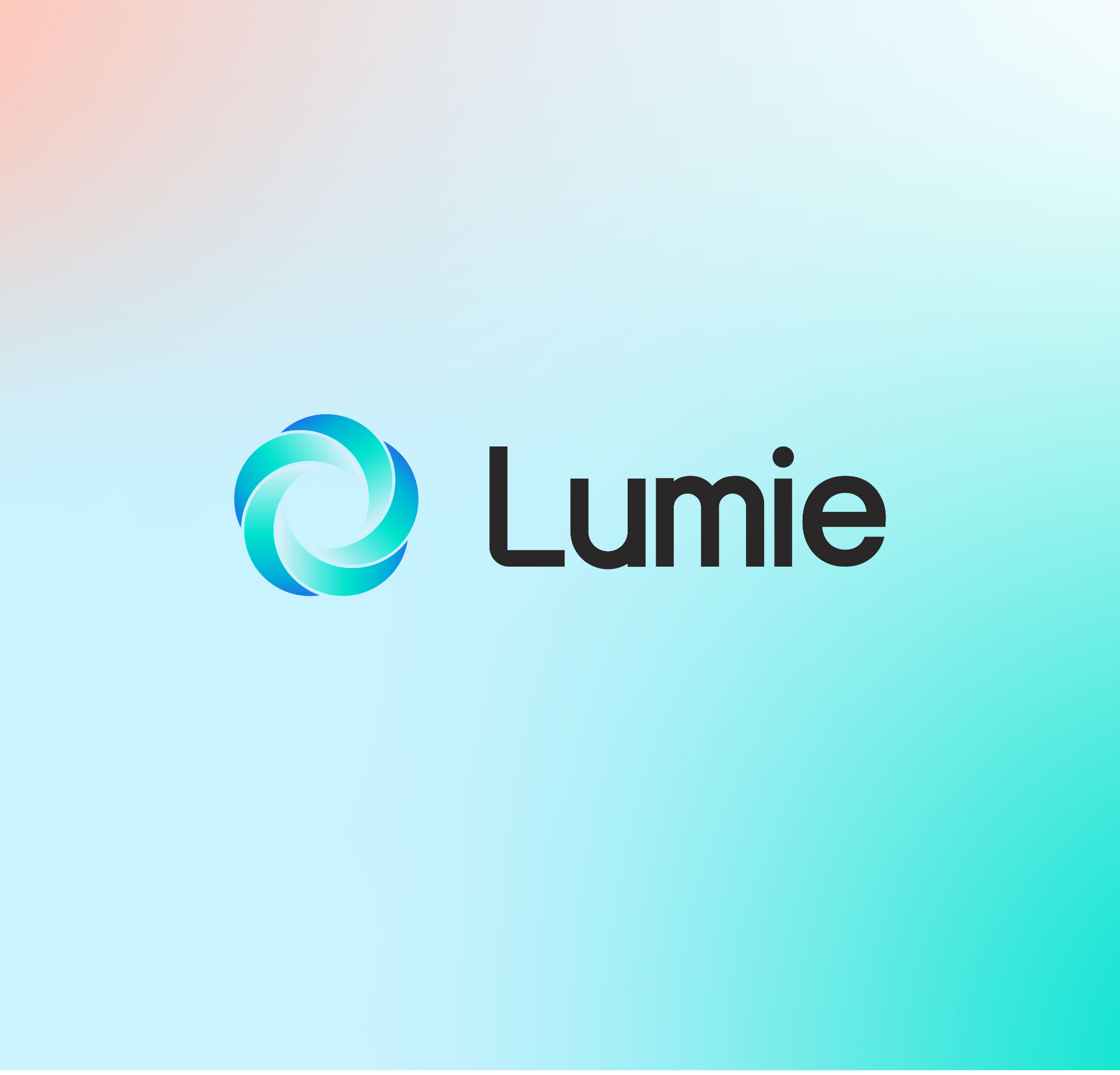
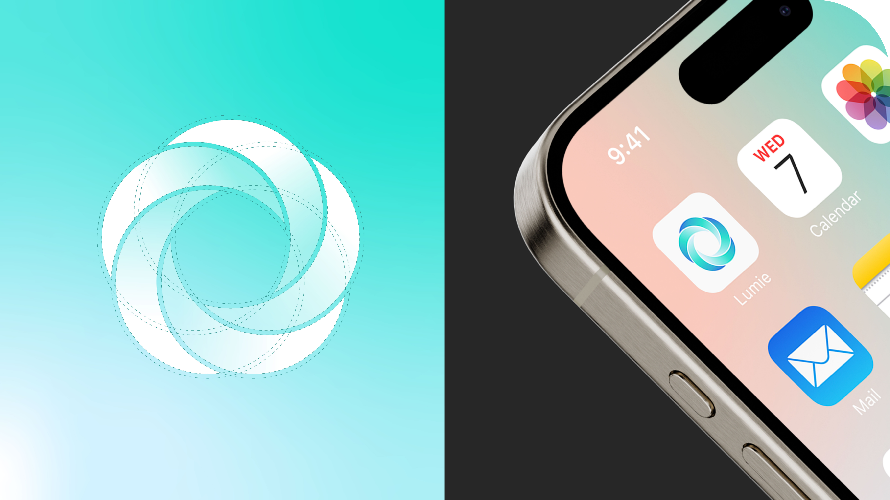
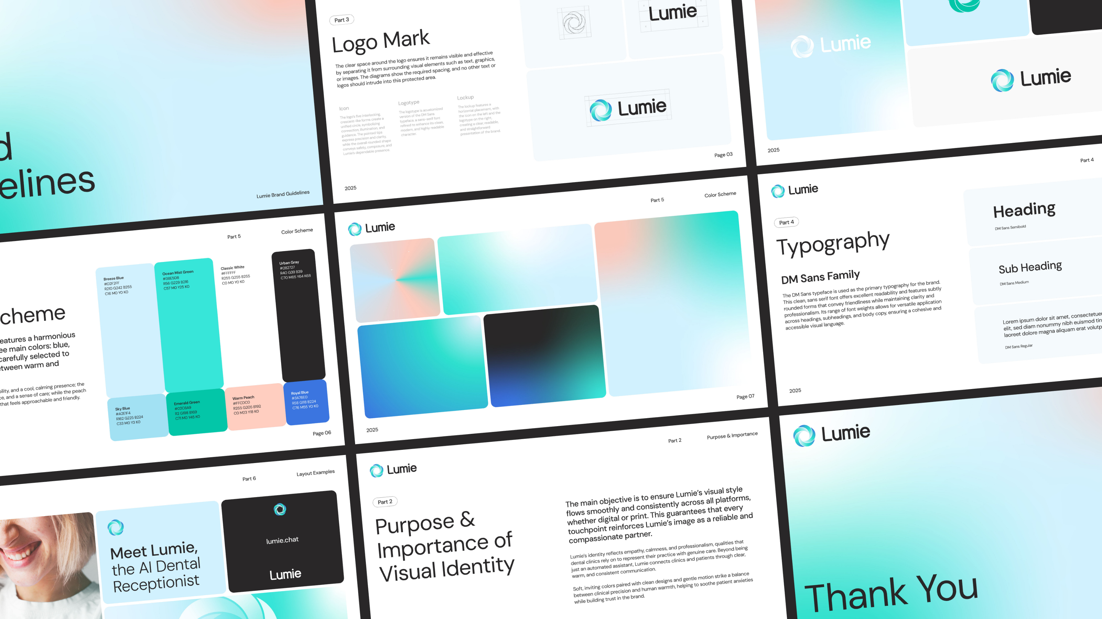
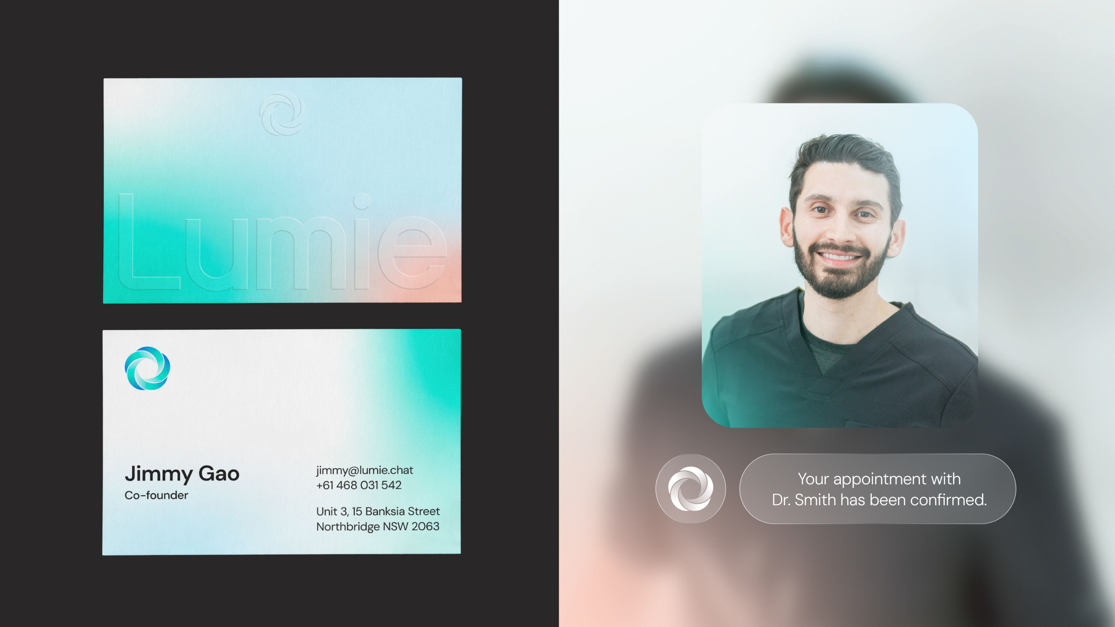
The Lumie logo is built from five interlocking crescent shapes that form a complete circle, representing connection and guidance. The sharp tips add a feeling of precision and clarity, while the circular form softens it with a sense of calm and reliability.
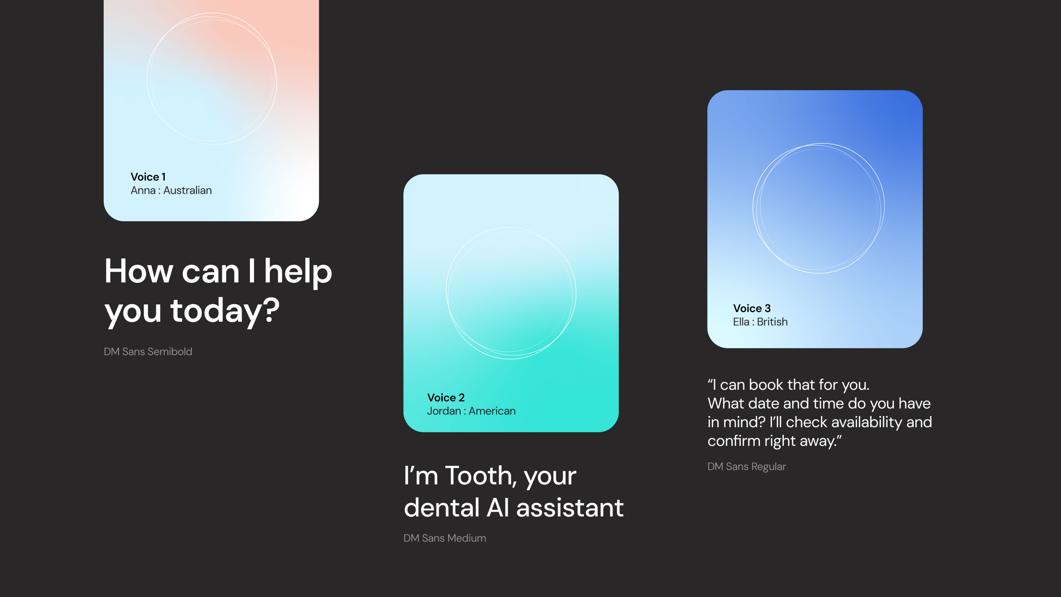
The logotype is based on DM Sans, refined into a custom version to feel cleaner and readable every touchpoint.
The lockup keeps things simple and clear, with the icon positioned on the left and the logotype on the right, making the brand easy to recognize and consistent wherever it appears.
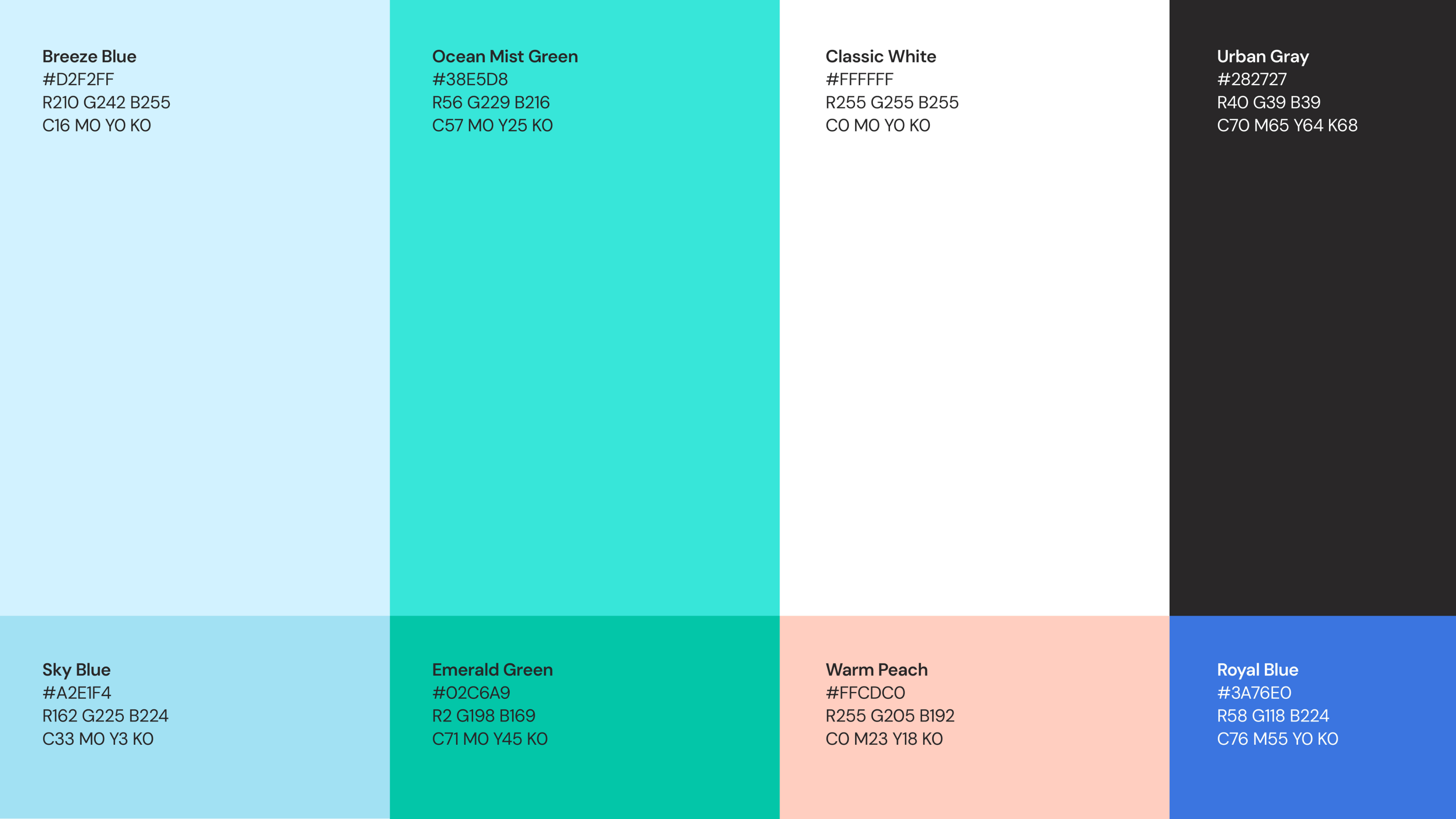
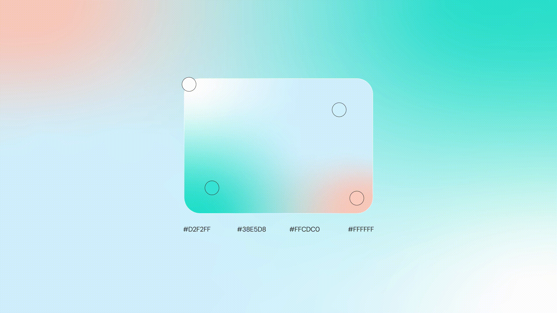
The color palette brings together blue, green, and peach in a way that feels both professional and human. Blue anchors the brand with a sense of trust, reliability, and calm. Green adds balance and signals care and steady growth. Peach softens the system, introducing warmth and approachability so the overall feel never becomes too clinical.
The motion system was designed to feel calm, direct, and trustworthy. Since Lumie supports dental clinics in high-pressure front-desk moments, the animation avoids exaggerated or overly playful movement. Instead, smooth pacing and natural easing help communicate reliability and a more human side to the AI experience.